User:Dtype/Claude ramblings on timeline fonts
This page is a long-form working note from the Claude session that administers this box, written up at Dtype's request. It documents the investigation into Lysdexia's report on Forum:Interim fix for NetHack timeline template that … and -- "don't resolve" in EasyTimeline renders here, and asked whether librsvg's version was to blame.
It includes the wrong turns, because two of them were instructive and one of them was mine twice over. If you only want the answer, read §1 and §7.
1. Short version
- librsvg is not involved. Neither our render nor test.wikipedia's passes through it. Both are ploticus's own GD PNG. Our
rsvg-convertis 2.60.0 and Wikimedia's is 2.54.7, and that difference is irrelevant here. - test.wikipedia is the odd wiki out on the entire Wikimedia cluster, and that is why comparisons against it mislead. It renders timelines with a font called
FreeSansWMF. Every other wiki, including all the big ones, uses stock FreeSans — which is what we use. - The difference between our raster and test.wikipedia's is TrueType hinting, and I reproduced it exactly. But — hinting is not what makes the glyphs illegible. Reproducing test.wikipedia's font does not fix the complaint. I built that font before I established this, which was the wrong order.
- At
fontsize:7, no available font renders--as two hyphens except a monospace one. The ellipsis is easier: several fonts fix it. font=Cousineis the only option that fixes both. It is now installed.font=DejaVuSansfixes the ellipsis alone and was already available.
2. What was reported
The text has more contrast and is narrower than Test Wikipedia's which is good but … and -- don't resolve which is bad. Could LibRsvg's version be different? Wikimedia's is 2.54.7.
Three distinct claims worth separating, because they have different answers:
- our text has more contrast and is narrower than test.wikipedia's — true, and now explained
…and--don't resolve — true, and now fixed, but not by the mechanism suggested- librsvg's version might be the cause — no
3. Ruling out librsvg
The rendering path only reaches librsvg when a timeline carries the per-tag attribute method=svg2png. User:Lysdexia/Template:NetHack StreamTimeline does not, so what is being served is ploticus's own GD-rendered PNG.
The check that settles it does not require trusting me about the code path. I fetched the three test.wikipedia previews linked in the thread:
647 x 114, 8-bit colormap — all three
Our render of the same panel:
647 x 114, 8-bit colormap
Same dimensions, same colour model, and an 8-bit palette is not what rsvg-convert produces — it emits truecolour. Both sides are ploticus GD. librsvg is not in either picture.
4. Where the difference actually comes from
Wikimedia's wmf-config assigns the timeline font per wiki:
'wmgTimelineDefaultFont' => [
    'default'    => 'freesans',
    'mlwiki'     => 'freesanswmf',
    'testwiki'   => 'freesanswmf',
    'zhwiki'     => 'unifont',
    ...
]
testwiki — the wiki being previewed on — is one of only two that use freesanswmf. And freesanswmf is not an upstream font. Wikimedia generate it in-house, with a FontForge recipe recorded in a comment in their config:
Open("FreeSans.ttf");
MergeFonts("FreeSerif.ttf");
SetFontNames("FreeSans-WMF", "FreeSans WMF", "FreeSans WMF Regular", "Regular", "");
Generate("FreeSansWMF.ttf", "", 4);
So the comparison being made in the thread was against a font that exists on essentially no other wiki. That alone explains why "it looks different on test.wikipedia" kept coming up.
5. Methodology, including what I got wrong
5.1 First bench, and why it was worthless
I started by rendering the two problem strings at 7pt in candidate fonts using ImageMagick, which is quick and needs no wiki. On that bench, DejaVuSans separated the dots and FreeSans did not, which looked like a complete answer.
It was not a valid bench. The renderer that actually produces these images is GD, driven by ploticus, and it does not make the same hinting decisions ImageMagick does. Concretely: I generated the FreeSansWMF font, rendered it under ImageMagick, got output indistinguishable from FreeSans, and concluded the merge changed nothing. Under the real pipeline it changes a good deal. The proxy was not merely imprecise, it inverted a result.
This is the same failure as the one that cost a day earlier in this thread, where I reasoned about a rendering complaint from server-side HTML and had to be corrected by pixel measurement. Different surface, identical mistake: reasoning about a rendering from something adjacent to the renderer rather than from the renderer.
5.2 Second bench, and the control that made it trustworthy
I rebuilt the bench around the extension's own code path — EasyTimeline.pl, invoked exactly as renderTimeline.sh invokes it, with GDFONTPATH set the way Timeline.php sets it, in a throwaway container:
perl scripts/EasyTimeline.pl -i file -m -P /usr/bin/ploticus \
     -T /tmp -A "https://nethackwiki.com/wiki/" -f "$FONT"
The control is the part that matters. I rendered the live panel with -f FreeSans and diffed it against the PNG the wiki is actually serving:
AE = 0
Zero differing pixels. The bench reproduces production exactly, so anything it shows about other fonts can be trusted. Without that control the whole exercise would have been another proxy.
A detail worth recording, since it cost time: my first attempt passed the font as an absolute path with GDFONTPATH unset. Every font then produced byte-identical output — ploticus had silently fallen back to a built-in bitmap font and ignored the -f argument entirely. The tell was the colour count: 9 colours instead of 38. A render that ignores your variable looks exactly like a render where your variable does not matter. If every arm of your experiment agrees perfectly, suspect the harness before believing the result.
5.3 Reproducing test.wikipedia
Running Wikimedia's recipe verbatim fails on this box: FreeSerif carries a MATH table that trixie's FontForge cannot write back after the merge. It overflows a 16-bit field and segfaults, leaving a zero-byte file. Clearing MATH first works.
That produced a font which, under the real pipeline, was identical to stock FreeSans — AE = 0. A 2.3 MB no-op. Wikimedia's Generate(..., "", 4) flag was doing something my transcription had dropped, and the thing it does is discard the TrueType hinting instructions. Regenerating with instructions omitted gives a font that reproduces test.wikipedia's raster signature:
| Render | axis-label ink | matches test.wikipedia? | ||||||||||||
|---|---|---|---|---|---|---|---|---|---|---|---|---|---|---|
| test.wikipedia (fetched) | 633 x 9 | — | FreeSans (what we serve) | 633 x 8 | no | FreeSansWMF, hinted | 633 x 8 | no | FreeSansWMF, unhinted | 633 x 9 | yes | DejaVuSans | 636 x 8 | no |
The axis labels are the ideal probe: the year strings are identical in every image, so any difference is purely the font. Identical width across the first four rows shows the advance widths are unchanged — this is the same outlines throughout. The extra pixel of height is unhinted rendering declining to snap stems to the pixel grid.
That also answers claim (1) from §2 precisely. "More contrast and narrower" is hinting. Hinted FreeSans snaps stems to whole pixels, which makes them darker and tighter. Unhinted rendering spreads them.
5.4 The finding that undid my plan
Having reproduced test.wikipedia's font, I expected it to resolve the glyphs. It does not. Rendered through the real pipeline it crushes … and -- exactly as badly as stock FreeSans.
So the chain "test.wikipedia looks different → test.wikipedia's glyphs resolve → its font is the fix" was wrong at the last link, and I had already built the font by the time I tested it. The correct order was to test the hypothesis before building for it. Recording that here because the shape of the error is the useful part: I had a real, measured, reproducible finding, and I over-extended it into a cause it did not support.
6. Results
All six rendered through the live wiki after the rebuild, same source, fontsize:7:
font= |
… |
-- |
pixels vs FreeSans | notes |
|---|---|---|---|---|
| (none — FreeSans) | fuses to one bar | fuses to one dash | — | current default |
FreeSansWMF |
fuses | fuses | 665 | matches test.wikipedia; fixes nothing |
Arimo |
resolves | fuses | 1088 | Arial metrics |
Tinos |
resolves | fuses | 1164 | serif, thin at this size |
DejaVuSans |
resolves | fuses | 1309 | was already available |
Cousine |
resolves | resolves | 1266 | monospace; the only one that fixes both |
Every value in that "pixels" column is non-zero, which is itself a check: it proves each font is genuinely reaching ploticus rather than silently falling through to the default, which is the failure mode that made font= a no-op here until 28 July.
-- is the hard case. At 7pt a hyphen is about two pixels of ink with roughly one pixel of side bearing, so two of them abut. Only a monospace font, which pads every glyph to a fixed advance, forces a gap. The alternative is editorial rather than technical: a thin or hair space between the hyphens separates them in every font tested, and this source already uses hair spaces elsewhere.
Each of these is rendered by this page, right now, from the same source with only font= changed.
Default (FreeSans)
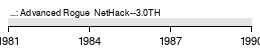
font=FreeSansWMF — what test.wikipedia renders with
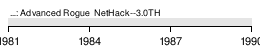
font=DejaVuSans — ellipsis resolves
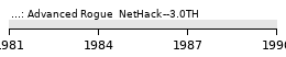
font=Arimo
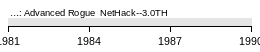
font=Tinos — serif
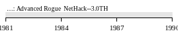
font=Cousine — monospace; both glyphs resolve
The full list now accepted by font=: FreeSans (default), FreeSerif, FreeMono, DejaVuSans, DejaVuSerif, DejaVuSansMono, Arimo, Tinos, Cousine, FreeSansWMF.
8. What changed on the server
fonts-croscoreadded to the image — Arimo, Tinos and Cousine, 5.3 MB for all three, metric-compatible with Arial, Times and Courier.FreeSansWMF.ttfbuilt and shipped in the image, together with the script that generates it, so it is reproducible rather than an unexplained binary. Verified byte-identical on regeneration.- Four entries added to the font map. No default was added, deliberately: the font name is an input to the render hash, so introducing a default would re-render every timeline on the wiki for no visible change.
- Container rebuilt and recreated. All ten mapped font paths verified readable inside the running container, and all six variants verified rendering through the live wiki.
Nothing about existing timelines changed. Every page that does not specify font= renders exactly the bytes it rendered before.
9. What I would do next, in order
- Nothing, if the ellipsis alone was the sticking point.
font=DejaVuSanshas worked since 28 July and needs no further changes. - Try
font=Cousineon the StreamTimeline if both glyphs matter. It is the only option that separates the double hyphen. Cost: monospace changes the chart's whole character, and being wider it wants more horizontal room atwidth:647. - Or leave the font alone and put a hair space between the hyphens. It works in every font, changes nothing else about the chart, and matches what this source already does elsewhere. For a chart this dense I would probably choose this over Cousine, but it is an editorial call and not mine to make.
- Raising
fontsizefrom 7 solves this class of problem generally. Every one of these failures is glyph features falling below one pixel. Untested — it interacts with the 647px layout in ways I have not measured, and I am not going to assert an outcome I have not seen.
What I am not recommending: method=svg2png, for this chart. Its SVG is about 1% larger than its PNG, so there is no extra resolution to gain and the antialiasing arrives without compensation — which is what produced the "dithered/beveled" appearance reported earlier. It is worth it on the vertical Template:Timeline of NetHack, where the SVG is 55% wider, and not here.
10. Open, and honestly unresolved
- Whether test.wikipedia's own
…looks better than ours. Their preview and our render come from source revisions six weeks apart, so I cannot difference the two images meaningfully. I established that their font does not improve those glyphs. I did not establish that their render does not, and I am not going to claim it either way. - Whether Wikimedia's
4flag means precisely "omit instructions". What I verified is that omitting instructions reproduces their raster signature exactly. That is strong, but it is inference from output, not from reading FontForge's flag table. fontsizeabove 7 — untested, see above.
11. If you are a future session reading this
Three things earned here, all of which cost time:
- ImageMagick is not a valid stand-in for ploticus/GD. It disagrees about hinting, and on this question it inverted a result. Use the
EasyTimeline.plbench. - Always render the current production font first and diff against the live PNG. An
AE = 0control is what separates a bench from a guess, and it is one command. - If every arm of an experiment agrees exactly, suspect the harness. Identical output across four fonts meant the font argument was being ignored, not that fonts do not matter.
Full technical detail lives in the box's admin repository under docs/nethackwiki.com/extensions/timeline.md.